
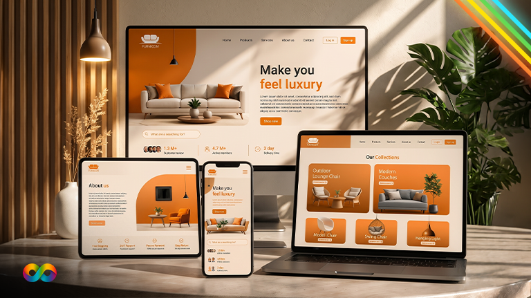

Before you read any further, try something. Open your own website on your phone, then turn the phone sideways. Now open it on a laptop and drag the browser window narrower and wider.
Did the page rearrange itself neatly every time? Or did you have to pinch, zoom and scroll sideways to read a sentence, with buttons too small to tap?
That 30-second test is the whole idea behind responsive web design. When it works, nobody notices. When it doesn’t, visitors leave, and Google notices too, because it now judges your site by how it works on a phone.
In this guide you’ll learn:
- What responsive design actually means (in plain English, then in a little code)
- Why it matters for Canadian businesses specifically
- The responsive techniques that matter in 2026
- Real examples from websites we’ve built
- A 25-point checklist you can use on your own site today
What is responsive web design?
Responsive web design is a way of building websites so one page, at one URL, automatically adapts its layout, images and text to fit any screen, from a small phone to a wide desktop monitor. The content stays the same; only the arrangement changes.
A responsive site doesn’t keep a separate “mobile version.” It’s one website with flexible rules. On a phone, a three-column services section becomes a single column. The menu tucks into a button. Images shrink to fit. Buttons get bigger and easier to tap.
The term was coined by web designer Ethan Marcotte in a May 2010 article for A List Apart. He described three ingredients: fluid grids, flexible images and media queries (A List Apart). Sixteen years later, those three ideas are still the foundation, although the tools have improved a lot.
What is a responsive site, in one sentence?
A responsive site is one where the same page looks and works properly at every screen size, without zooming, sideways scrolling or a separate mobile website.
Why responsive design matters for Canadian businesses
1. Your customers are split almost evenly between phones and desktops
In Canada, desktop still edges out mobile. StatCounter’s September 2026 data shows desktop at 50.56%, mobile at 46.36% and tablet at 3.08% of web traffic in Canada (StatCounter).
That near-even split is exactly why responsive design matters here. You can’t design “for mobile” or “for desktop.” Roughly half your visitors are on each, and the same person often switches: they find you on a phone during the commute, then book from a laptop at work.
Your own numbers will differ by industry. A restaurant or barbershop usually skews heavily to mobile. A B2B manufacturer often skews to desktop. Check Reports → Tech → Overview in Google Analytics 4 to see your split.
2. Google ranks your site based on its mobile version
Google uses mobile-first indexing: it crawls and indexes the mobile version of your pages with its smartphone crawler, and uses that version for ranking (Google Search Central). Google announced in October 2023 that the move to mobile-first indexing was complete (Google Search Central Blog).
Two things follow from that:
- If content is missing or broken on your mobile layout, Google may not see it at all.
- Google explicitly recommends responsive design as the easiest pattern to implement and maintain, because the same HTML is served at the same URL to every device.
3. Speed and stability are measured separately on mobile
Google’s Core Web Vitals are measured for mobile and desktop separately. A “good” page loads its main content in 2.5 seconds or less (LCP), responds to taps and clicks in 200 milliseconds or less (INP), and keeps layout shift at 0.1 or less (CLS), measured at the 75th percentile of real visits (web.dev). Phones usually have slower processors and connections, so a site can pass on desktop and fail on mobile. Responsive design done well (properly sized images, no heavy desktop-only scripts on phones) is a big part of passing.
4. Accessibility rules apply to the mobile experience too
In Ontario, businesses and non-profits with 50 or more employees must make public websites meet WCAG 2.0 Level AA under the AODA (Ontario.ca). Newer WCAG versions add two criteria that are really responsive design rules:
- 1.4.10 Reflow (WCAG 2.1, Level AA): content must work at a width of 320 CSS pixels without scrolling in two directions (W3C).
- 2.5.8 Target Size (WCAG 2.2, Level AA): tap targets should be at least 24 by 24 CSS pixels, with some exceptions (W3C).
The AODA currently points to WCAG 2.0, so these two aren’t legal requirements in Ontario yet. They are still good practice, and they’re exactly what visitors with a phone in one hand need.
5. It’s cheaper than the alternative
One responsive site means one set of pages to update, one set of URLs to rank and one place to fix problems. Running a separate mobile site (like the old m.example.ca approach) means double the maintenance and a constant risk that the two versions drift apart.
How responsive design works: the three original ingredients
Ingredient 1: Fluid grids
Instead of fixed widths in pixels (a column that’s always 960 pixels wide), layouts use relative sizes: percentages, fractions of the available space, or flexible units. When the screen gets narrower, columns get narrower or stack.
.services {
display: grid;
grid-template-columns: repeat(auto-fit, minmax(260px, 1fr));
gap: 24px;
}
That one rule puts as many 260-pixel-minimum cards on a row as will fit: one on a phone, two on a tablet, three or four on a desktop. No breakpoints needed.
Ingredient 2: Flexible images
Images should never be wider than the space they sit in:
img {
max-width: 100%;
height: auto;
}
Modern responsive images go further and let the browser download a smaller file on a small screen, which helps loading speed:
<img src=”clinic-800.webp”
srcset=”clinic-400.webp 400w, clinic-800.webp 800w, clinic-1600.webp 1600w”
sizes=”(width < 700px) 100vw, 50vw”
width=”1600″ height=”900″
alt=”Front desk of a dental clinic in Mississauga”>
The width and height attributes reserve space so the page doesn’t jump when the image loads (that’s your CLS score).
Ingredient 3: Media queries
Media queries apply different CSS at different screen widths. The width where the layout changes is called a breakpoint.
/* Mobile first: one column by default */
.page { display: block; }
/* Wider screens: add a sidebar */
@media (width >= 900px) {
.page {
display: grid;
grid-template-columns: 2fr 1fr;
}
}
And one line you can’t forget: the viewport meta tag
<meta name=”viewport” content=”width=device-width, initial-scale=1″>
Without it, phones pretend to be a desktop-width screen and shrink the whole page down, so all your careful breakpoints never trigger. MDN’s advice is blunt: you should always include it (MDN).
Responsive techniques that matter in 2026
The original three ingredients still work, but modern CSS has made responsive design cleaner and more reliable. These are the responsive techniques we use on new builds:
| Technique | What it does | Why it helps |
| Mobile-first CSS | Write the phone layout first, then add complexity for wider screens | Phones load the simplest CSS; forces you to prioritize content |
| CSS Grid and Flexbox | Layout systems that rearrange content automatically | Fewer breakpoints, fewer layout bugs |
| Fluid typography with clamp() | Text scales smoothly between a minimum and maximum size | Headlines don’t overflow on phones or look tiny on desktops |
| Container queries | Components respond to the width of their container, not the whole screen | The same card works in a sidebar and in a full-width section |
| Responsive images (srcset, sizes, WebP/AVIF) | Browsers download the right image size | Faster mobile loading, better LCP |
| Lazy loading | Images and videos below the fold load only when needed | Faster first load, especially on video-heavy pages |
| Touch-friendly targets | Buttons and links sized and spaced for fingers | Fewer mis-taps, meets WCAG 2.5.8 |
| Content-based breakpoints | Breakpoints set where the design breaks, not at specific phone models | Works on devices that don’t exist yet |
A quick example of fluid typography:
h1 {
font-size: clamp(2rem, 1.2rem + 3vw, 3.5rem);
}
The heading is never smaller than 2rem on a phone or larger than 3.5rem on a big screen, and scales smoothly in between.
Responsive vs adaptive vs a separate mobile site
People often mix these up. Here’s how they compare:
| Responsive design | Adaptive design | Separate mobile site (m.) | |
| How it works | One flexible layout that adjusts continuously | Several fixed layouts; the server or browser picks one | A second website on a different URL |
| URLs | One per page | One per page | Two per page (example.ca and m.example.ca) |
| Maintenance | One site | Several layouts to maintain | Two sites to keep in sync |
| Google’s view | Recommended as easiest to maintain | Supported | Supported, but needs careful setup and identical content |
| Devices it handles | Any width, including future ones | Only the widths you designed for | Only phones vs desktops |
| Best for | Almost every business website | Specialized apps with very different device needs | Legacy setups being phased out |
For a service business, a store or a professional practice in Canada, responsive is the right answer in practically every case.
Real examples: responsive design in practice
Theory is one thing. Here’s what responsive design looks like on real projects.
My Own Rental: when mobile is the booking channel
My Own Rental rents jet skis and pontoon boats on Lake Simcoe. Their customers often decide on the spot, on a phone, sometimes standing at the marina. We turned the site from an information brochure into a booking engine, with Checkfront real-time availability built into the site, dedicated Keswick and Innisfil launch pages and tap-to-book on mobile (case study).
On a desktop, availability and photos sit side by side. On a phone, the layout stacks so the date picker and “Book” button are always within thumb reach.
[IMAGE: My Own Rental at phone, tablet and desktop widths] [CONFIRM 1]
Elev8 Media: heavy video without a heavy mobile page
Elev8 Media is a Brampton media production company. Their site needed an auto-playing reel of seven productions and 13+ property video showcases, which is a lot of weight for a phone on mobile data. We built a custom WordPress theme where the showcases lazy load, so phones only download videos when a visitor scrolls to them (case study).
Six common responsive patterns (and how to get them right)
| Element | On desktop | On a phone> | Watch out for |
| Navigation | Full horizontal menu | Menu button that opens a panel | Hiding your phone number or “Book” button inside the menu |
| Service cards | Three or four across | One per row | Cards so tall that visitors never reach the next section |
| Tables (prices, specs) | Full table | Stacked rows or a scrollable table | Tables that push the whole page sideways |
| Forms | Two columns of fields | One column, large fields | Tiny fields, wrong keyboard (use type=”tel” and type=”email”) |
| Hero section | Wide image with text beside it | Text first, image smaller or cropped | Headline hidden behind a full-screen image |
| Contact options | Phone number as text | Tap-to-call button | Phone numbers that aren’t clickable |
8 responsive design mistakes we still see every month
- Content hidden on mobile. Removing sections “to keep it clean” means Google’s mobile crawler may never see them. Collapse content into accordions instead of deleting it.
- Desktop images on phones. A 3,000-pixel hero image squeezed into a phone screen still downloads at full size.
- Pop-ups that cover the whole screen. On a phone, a large pop-up can make the page impossible to read until it’s closed.
- Tap targets that are too close together. Two links side by side that are easy to click with a mouse are easy to mis-tap with a thumb.
- Fixed headers that eat the screen. A sticky header plus a sticky banner can take up a third of a small phone screen.
- Text set in pixels that never scales. It may look fine on your phone and unreadable on someone else’s.
- Testing only on the designer’s phone. Real visitors use small Android phones, large iPhones, tablets in portrait and old laptops.
- Theme “mobile settings” that override good design. Some page builders let you hide or reorder content per device, which can quietly create a different, thinner mobile page.
If several of these sound familiar, our guide to 10 eCommerce website design mistakes covers related problems that hit online stores hardest.
How to test whether your website is responsive
You don’t need special software. Use a mix of these:
- Resize your browser. On a laptop, drag the window from full width down to its narrowest. Watch for overlapping text, cut-off images and sideways scrolling.
- Chrome DevTools device mode. Press F12, then the phone-and-tablet icon (or Ctrl+Shift+M). Choose different devices, and set a custom width of 320 pixels to check WCAG reflow.
- Real phones. Borrow a small Android phone and a large iPhone. Test portrait and landscape. Fill in your contact form with your thumb.
- Google Search Console. The Core Web Vitals report shows mobile and desktop results separately, using real visitor data. New to Search Console? Use our setup guide.
- PageSpeed Insights. Run your key pages and look at the mobile tab first.
- Your analytics. In GA4, compare conversion rate by device category. A big gap between mobile and desktop usually means the mobile experience is getting in the way.
The 25-point responsive design checklist
Use this when designing a new site, approving a redesign or auditing what you have now.
Layout and content
- 1. The viewport meta tag is present on every page
- 2. No sideways scrolling at 320 pixels wide
- 3. The same main content appears on mobile and desktop (collapsed, not removed)
- 4. Layout uses flexible grids, not fixed pixel widths
- 5. Breakpoints are set where the design needs them, not for specific phone models
- 6. Tables either stack or scroll inside their own container
Text and readability
- 7. Body text is at least 16 pixels on phones
- 8. Headings scale down on small screens without breaking into one word per line
- 9. Lines of text aren’t too wide on large screens (roughly 60 to 80 characters)
- 10. Colour contrast is readable outdoors on a phone
Navigation and actions
- 11. The main call to action (call, book, quote) is visible without opening the menu
- 12. Phone numbers are tap-to-call links
- 13. Buttons and links are at least 24 by 24 pixels and well spaced (44 pixels or more is more comfortable)
- 14. Sticky headers take up only a small part of the screen
- 15. Pop-ups are small, easy to close and don’t block content on arrival
Forms
- 16. Forms are one column on phones
- 17. Fields use the right input types so the right keyboard appears
- 18. Labels stay visible (not only placeholder text)
- 19. Error messages appear next to the field, in view
Images, video and speed
- 20. Images use srcset or your CMS’s responsive image sizes
- 21. Images are in WebP or AVIF where possible, with width and height set
- 22. Below-the-fold images and videos lazy load
- 23. Mobile Core Web Vitals pass in Search Console (LCP, INP, CLS)
Testing
- 24. Tested on at least one small Android phone, one iPhone and a tablet, in both orientations
- 25. Mobile vs desktop conversion rates checked in GA4 after launch
For a deeper speed walkthrough, download our free Core Web Vitals ebook. For the page-level SEO checks that sit alongside these, see our on-page SEO checklist.
Does responsive design cost extra?
Not on a modern build. Every website we design is responsive by default: it’s part of the design and development process, not an add-on. Our published WordPress packages start at $2,500 and each one includes a mobile-responsive design (pricing).
Where cost goes up is fixing an old, non-responsive site. Retrofitting a fixed-width theme often takes nearly as long as rebuilding it, so we usually recommend a redesign. If you’re weighing that up, our website design cost guide breaks down the numbers, and the website redesign SEO checklist protects your rankings during the switch.
Frequently Asked Questions
Responsive design means a website automatically rearranges itself to fit the screen it's viewed on. The same page works on a phone, tablet or desktop without zooming or sideways scrolling.
"Mobile-friendly" just means a site works on phones. Responsive design is one way to get there, using one flexible layout for every screen size. Most mobile-friendly sites today are responsive.
Yes. Google indexes the mobile version of your pages and recommends responsive design because the same content sits at the same URL on every device. It also makes it easier to pass Core Web Vitals on mobile.
Fluid grids, flexible images and media queries are the foundation. Modern sites add mobile-first CSS, CSS Grid and Flexbox, fluid typography with clamp(), container queries, responsive images and lazy loading.
All of them. Instead of designing for specific phones, test from 320 pixels wide up to large desktop screens and set breakpoints wherever the layout starts to look wrong.
Open it on your phone, then resize your browser on a laptop. If you have to zoom or scroll sideways, or the text and buttons are tiny, it isn't fully responsive. Chrome DevTools and Search Console give you more detail.
No. A separate mobile site doubles your maintenance and is easy to get wrong for SEO. A responsive site handles every device from one set of pages.
Yes. Most modern themes are responsive, but quality varies a lot, especially after heavy customization. Compare platforms in our WordPress vs Wix vs Squarespace guide.